Artists’ Use of Perspective in Picture Books
Prisca and Ray Martens

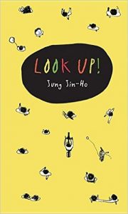
Look Up! by Jung Jin-Ho
Prisca:
I can’t think of another book like this one. It’s so unusual with such a beautiful story. I read several spreads before I figured out what I was looking at. With each page turn Jin-Ho provides clues to help readers understand they have a bird’s eye view of a street scene with a girl in a wheel-chair positioned vertically along the right side looking down over the balcony railing. She calls for people to “Look up!” Finally a young boy hears her and looks. When she explains she can only see the tops of people’s heads, the boy lays down on the ground so she can see his whole body! Other passers-by realize what he’s doing and they also lay down. I find that so clever! What do you think about Jin-Ho’s use of perspective in this book?
Ray:
It is interesting that the entire book would be from a bird’s eye view. Usually a picturebook shows multiple viewpoints in the art, but not all from one perspective. Perspective, as part of the art element of space, is made up of one, two, three and even four points. Viewpoints are normally from ground level. Standing on the ground and looking up is more a commonly represented perspective than what a bird would see or the view from a flying airplane. In this book, the view in every illustration is from the top of a tall building looking straight down. It takes a talented artist with strong technical skills to draw objects from above, looking down on them. Here we see humans, umbrellas, trees, etc. from this bird’s eye perspective.
Prisca:
As I think about it and look more closely, there are several things I wonder about related to this book. I wonder why Jin-Ho created the entire book with the perspective from above, which we agree is unusual. Maybe it’s to emphasize the different perspectives people, such as those using wheelchairs, have on the world. I also wonder why the only complete face with eyes, nose, and mouth is the girl’s on the balcony towards the end of the book. At the end when she’s on the street and sitting on a bench, she doesn’t have eyes either. I’m not sure why. Did you notice those things?
Ray:
As I look at the girl on the balcony, I see only a possible mouth, part of a nose, and possible cheek. I feel that maybe the artist used a minimalist style without facial details to focus on the story, not the characters. This way the story is universal and can be anywhere with anyone! Going back to the language of an artist, the art provides examples of line, shape, and pattern. Black and white value is present up to the very end of the book. At that point, the element of color is introduced when the girl in the wheelchair comes down and joins the others. Maybe the point is the joy anyone in any condition brings into others’ lives.
Prisca:
I like that. The use of black and white until the end also emphasizes the story content, rather than emotion, brought in on the last page. Great book!

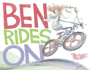
Ben Rides On by Matt Davies
Prisca:
I love this book! It’s a powerful story of bullying, helping someone in need even if you don’t want to, how/why not to be a bully, and friendship. Ben has a new bike that he loves and can’t wait to ride to school. Adrian, a bully much larger than Ben, takes the bike and leaves with it. The ending caught me off guard. It’s full of plot twists and turns with a beautiful conclusion. The ways Davies creates depth in his art and his changes in perspective at significant points in the story pull readers in. One place that happens for me is when Ben is walking home from school (since Adrian has his bike), hears a peculiar sound, and runs to investigate. That page shows Ben’s back, with the over-sized shoe bottom for his foot that is off the ground. The shoe bottom is about the length of Ben’s other leg. It’s a great picture! Davies makes me feel like I’m running too, right behind Ben.
Ray:
This book has impressive examples of the art element of space. Space, as one of the art elements, deals with ways that artists create a sense of 3-D on a 2-D surface. The double page spread that you refer to has Ben walking home on the left side page, which is a great example of foreground, middle ground, and background. The illustration on the right side that shows the over-sized shoe is an example of foreshortening. Foreshortening is the perspective of drawing an object such as a human figure with one body part very close to you and then other parts receding into the background. It has always been a challenge to artists.
Prisca:
Is it called foreshortening because the enlarged body part close to the reader is in the foreground?
Ray:
I am not sure how the term originated but, if working with the human body as an example, the body part closest to us (foreground) is much larger and parts in the middle ground and background get proportionally smaller. This idea of perspective developed during the Renaissance.
Prisca:
A couple spreads later, Ben finds Adrian hanging on a tree branch below a cliff. The left side of the spread is the view Adrian taken over Ben’s shoulder and the right side is Adrian’s view of Ben from below. Readers don’t see Adrian in that picture and have to infer Adrian is looking up at Ben’s head gazing down at him. It’s clear from the positioning, Ben’s eye contact with Adrian, and Ben’s grin that Ben now holds the power.
Ray:
This is classic one-point perspective. Yes, from the left illustration we know Adrian is below looking up and Ben is looking down. Without the illustration on the left, we could imagine Adrian is looking down on the Ben and not up. This is an example of how art can be viewed or interpreted in different ways and how the art works together throughout a picturebook to make meaning.

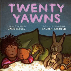
Twenty Yawns by Jane Smiley with illustrations by Lauren Castillo
Prisca:
This is one of my favorite new books this year. It’s a warm story about a young Lucy’s trip to the beach with her mom and dad. After an exciting day of swimming and playing in the sand, the family heads home tired and with plenty of yawns! The deceptively simple story of family love and bedtime is enhanced by the beauty of Lauren Castillo’s art. One of my favorite double page spreads is Mom and Lucy back at home looking out the window at the sunset. The setting sun is at the bottom edge of the page, which allows for a full page of sky colors. The blues, pinks, purples, and reds take my breath away.
Ray:
Lauren did something very interesting on that sunset page. Just above the sun is a subtle strip of green. It’s easy to miss if readers don’t look carefully. That is viridian green and it foretells the color of light at night. There is a famous series of photos taken by a high-speed camera that caught this green right before sunset. The endpapers are a shade of viridian green. Lauren uses this same green in the background of the two double-page spreads of the bedroom with moonlight shining in.
Prisca:
Those spreads are wonderful for another reason too. The first one shows Lucy in bed looking out the window at the moon. The moonlight is shining through the window on the floor, bed, and Lucy. The next spread is the “window’s” view. The moonlight stretches from the window, which is not in the illustration, across the floor, and onto the bed and Lucy. Readers must infer the illustration is from the perspective of the window. The spreads build on each other and are interdependent.
Ray:
There are several things I love about each one of these two page spreads. In the first double page spread you look at the moonlight coming in the window on the upper right of the page. The moon in the window reminds me of the moon in the bedroom of Where the Wild Things Are. Lauren did not put in the baseboard to show us where the wall ends and the floor starts. We just sense that from the horizontal edge of where the moonlight starts as it hits the floor and spreads across the bed and lights up the bedcover. You feel a strong sense of perspective as it moves from background to foreground in the lower left. Artists know that normally you place a subject at the top of a composition to show something in the background as Lauren did here. You place objects on the bottom of the composition to show things in the foreground. There’s a strong sense of moving from lower left to upper right in the composition. Lauren’s illustration gives us a great example of two-point perspective with the light and dark shapes of the moonlight hitting the floor and moving across the bed. She did not need to put in any details of what is the back wall and the floor–only the shapes created by the moonlight.
In the next double page spread, we now see the baseboard at the bottom of the wall. You see a lighter value of the viridian blue-green on the wall and a darker value of the same hue on the floor. I love how she added another source of light in the room–the lamp light, and how it hits the table top, the backs of the rocking chair and bed and the three pieces of artwork on the walls. I love the art work on the wall. The three works are great examples of a young child’s art placed on the wall with tape. From a standpoint of composition, imagine for a moment that you remove those three art pieces. The total composition of the spread would change dramatically from feeling in balance to seeming out of balance. Balance is one of the principles of design in the language of art. Lauren, being the great artist that she is, knew something needed to be placed on the wall to make the composition complete. I love how that artwork is on the back of the dust jacket.

School’s First Day of School by Adam Rex with illustrations by Christian Robinson
Prisca:
This is such a clever book, with the new school being nervous about the first day. The janitor helps the school know what to expect and then, on the first day, the school meets the children and observes all the happenings in the classrooms, lunch room, and at recess. Christian Robinson’s art fits the story. It doesn’t have a lot of details, similar to the art young children create. The endpapers seem to be a bird’s eye view of the playground but readers see the full children, not just the tops of their heads. Is it really a birds-eye-view then?
Ray:
It’s a bird’s-eye view that includes several perspectives in one illustration. Including several perspectives in one piece of art is a classic view artists sometimes use. The endpapers are one example. Other examples are the spreads with the children sitting on the rug listening to the teacher read and the children sitting around the table. In these illustrations the perspective is from the ground but again includes full views of the children. This technique used by Robinson fits well with the art children do at a young age.
Prisca:
I like how Robinson matched the art to the story content. That’s one of the powerful things about picturebooks. None of the art is framed either; it flows to the edges of the pages which makes readers feel like they’re at the school with the kids.
Ray:
I also like how Robinson simplifies the objects in each illustration. He does not worry about details as young children don’t. The cars are just simple shapes with wheels. The buildings are just basic shapes with a door and windows. The perspective in the buildings, when you think of classic two-point perspective, such as the double page spread of the bus bringing student to school, is not exactly correct. This is what makes these illustrations very child-like and great.
