Mary L. Fahrenbruck and Violet Henderson, New Mexico State University, NM
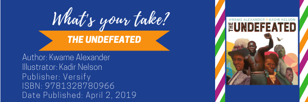
In their fourth MTYT installment for April 2020, Mary Fahrenbruck and Violet Henderson provide their take on Kwame Alexander’s The Undefeated, illustrated by Kadir Nelson. The Undefeated was the winner of the 2020 Caldecott Medal, the winner of the 2020 Coretta Scott King Illustrator Award, and was a 2020 Newbery Honor Book.

MARY: Kwame Alexander wrote the poem The Undefeated in 2008 as a tribute to his newborn daughter and to Barack Obama, the first African American U.S. president. He wanted his daughter to “know how we got to this historic moment” in time. While I was moved by Alexander’s poem, I was blown away by Kadir Nelson’s oil on panel illustrations. In several interviews (e. g. NPR) Nelson tells listeners how he used color, shadows and light to symbolize the individuals in the illustrations were moving out of the darkness, into the light. For example, Jesse Owens hurdles out of the shadows into the light on the first double page spread. Nelson masterfully uses ambience and gaze to connect readers with the individuals in his illustrations. Specifically, he forefronts each illustration on a stark white background, painting most individuals looking directly at the reader. The absence of setting and the outward gaze of the individuals evokes strong emotions from the readers as they have no other choice but to engage with the people in the paintings.
One question I have about the illustrations pertains to the white, web-footed birds featured on the pages near the middle and end of the picturebook. My guess is that they are herons because of their S-shaped necks. According to a simple Google search, the white heron symbolizes wisdom, good judgement, independence and successful journeys. If my guess is accurate, I think the inclusion of the heron is appropriate for the prose near the end of the poem. I wonder what purpose Nelson intended the birds to serve. What is your take on the illustrations in The Undefeated, Violet?
VIOLET: Good find, Mary. I noticed the herons on the title page, as well. The poem, along with the illustrations, gave me chills as I read the words and became immersed by the significance of both. Considering the representation of the words on each page, the words themselves are artistic. Not all the words share the same font, and they seem to expressively align with the illustrations on the page. For example, as you discussed Jesse Owens, the words “hurdled history” along with “unforgettable” and “possible” appear in enlarged print. The illustration shows Jesse Owens hurdling through the air. There is such stunning detail accentuating the definition of his arms and leg muscles. Further along where we find the illustration of the Civil War soldier, the words “unafraid,” “audacious,” “battlefield,” and “Imperfect Union” appear again in larger-sized print with the words “Weary Blues” in italics. The expression and emotion on the soldier’s face, the look in his eyes, and his stance holding the American flag seem to embody the words on the page. Furthermore, this approach also speaks to the white space that served as the illustration as found on the layout with the words “And the ones who didn’t.” with “didn’t” in enlarged font. Extremely powerful. And yes, now I am curious about the symbolism behind the herons. I also want to ask about the significance of the words represented in different fonts and if my take is partially correct.
MARY: I think we need to talk with Kwame and Kadir to get some clarification about our wonderings! The one thing we both know is that every detail of a picturebook is deliberate. The enlarged font, the use of “un” words in the poem, the herons, the white space; all these elements come together to create a unique reading experience for readers. For me The Undefeated did more than create an experience. The picturebook became the pebble dropped into a pool of water. My thoughts rippled out in every direction as I wondered about the people in the illustrations and their life experiences.
VIOLET: I love the imagery you describe with the “pebble drop” metaphor. I totally agree, Mary, The Undefeated creates more than a reading experience. In engaging and transacting with the poem and illustrations, there is so much more that is presented and represented; it is a genuine and compelling work of art. I hope our take has piqued WOW readers’ interest in this award-winning picturebook. Mary and I invite you to share your take!
Title: The Undefeated
Author: Kwame Alexander
Illustrator: Kadir Nelson
ISBN: 978-1328780966
Publisher: Versify
PubDate: April 2, 2019
Awards:
2020 Caldecott Medal
2020 Coretta Scott King Illustrator Award
2020 Newbery Honor Book
Golden Kite Award for Picture Book Text
Throughout April 2020, Mary and Violet give their take on books that have won awards or honors this year. Check back each Wednesday to follow the conversation!
- Themes: Kadir Nelson, Kwame Alexander, Mary Fahrenbruck, Undefeated, Violet Henderson
- Descriptors: Awards, Books & Resources, My Take/Your Take
