
The Use of Red in Picturebook Art
with Prisca and Ray Martens
 Louise Loves Art by Kelly Light
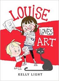
Prisca: “I love art! It’s my imagination on the outside.” That’s Louise’s opening statement as she stretches out on the floor, surrounded by her artwork with her younger brother Art and her cat looking on. This is an inspiring story of imagination and creativity that also highlights family and sibling love. Louise is confident in and focused on her artwork but realizes the importance of celebrating the creativity of her younger brother who clearly admires her.
Ray: Elliot Eisner says, “Art is literacy of the heart.” For both Louise and Art, art is literacy of the heart. It is their way of visually expressing what they feel in their hearts. Many students and adults who have difficulty expressing themselves through writing or speaking rely on creating visual images to communicate. Expressions through art are, as the dust jacket states, “a celebration of the brilliant artist who resides in all of us.”
It’s interesting that Kelly Light chose the color red as the dominant hue in the book. Red is one of the three primary colors and is the most intense of the hues on a color wheel. Primary colors cannot be obtained by mixing other hues on the color wheel. They are only obtained from nature. Red has different symbolic meanings in many cultures around the world. Examples of the use of red are the cape used by a bullfighter, hearts for Valentine’s Day, red envelopes in Chinese New Year, red shoes in movie “The Wizard of Oz”. In India brides wear red on their wedding days. There are many other examples.
Prisca: What about the other colors in the illustrations, like yellow and black?
Ray: You have to remember that white and black are technically not a part of the color wheel. White is the addition of all colors in a color wheel, black is the absence of color, and brown, as seen in Louise’s hair, is an earth color and not part of the color wheel. The yellow in Art’s hair offers a minor contrast. Red is also used for the endpapers and highlights Louise’s glasses and L signature, the stripe on her shoes, the scissors, Art’s pants, the red crayon, and other items throughout the book. Any other hue, such as blue, yellow, green, orange or violet would not have the same intense effect to draw our attention to each part of every illustration.
Red usually symbolizes the heart, making it a great choice for Louise’s heart being expressed “on the outside”. Kelly Light’s use of red shows Louise’s intense passion and love for art and Art.
 Nana in the City by Lauren Castillo
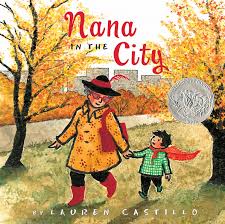
Prisca: This is a wonderful story about precious time Nana and her grandson spend together at Nana’s new home in the city. As the boy narrates, his excitement about seeing Nana changes to discomfort and fear as he and Nana travel through the dark busy subway, loud traffic-filled avenues, and scary streets to Nana’s apartment. Despite Nana’s assurance that the city is “bustling, booming, and extraordinary,” the boy has trouble sleeping with the new sights and sounds outside his window. After tucking him safely back in bed, wise Nana begins knitting with red yarn and in the morning presents the boy with a red knit cape to wear as they venture out. Filled with courage, the boy takes the lead as they explore the park, listen to musicians, watch dancers, and share pretzels with a lonely man on the street. When it’s time to go home, the boy wraps Nana in his cape to keep her brave until his return.
Lauren’s effective use of red for Nana’s boots, purse, patterns on her coat, and features of her hat highlight her spunky energetic nature that breaks the stereotypic grandmother mold. The red cape not only helps transform the boy’s fears into courage but emphasizes the lasting loving bond between Nana and her grandson.
Ray: One of the first things that struck me, besides the story itself, is the use of red and its complement on a color wheel, green. The dominant hue on the cover is red, with green coming in second. You turn to the end papers and they are green. Red is used for the title names, the beginning letter on the inside dusk jacket, and then notice red being used for the dot at the bottom of the title page and the red dot separating information on the next page publishing information. The beginning story line page starts with a big red I. We begin seeing Lauren start to use the complements of red and green in each illustration. Now we come to the page of Nana and her grandson in the apartment having milk and cookies. What color are her glasses. GREEN! She has gone from red glasses to green glasses. Note the color of the yarn. Orange. On the next double page spread she is wearing her green glasses and knitting with green yarn. The next double page spread she starts knitting with red yarn, both green and yellow orange yarn beside her. Turn the next couple pages and we see the grandson in green pajamas and wearing his new red knitted cape. Now they leave the apartment to go out into the city and grandmother is back to wearing red glasses. Turn each page and see what examples you can find of Lauren placing compliments of red and green in the illustrations.
Prisca: Why is it important to use complementary colors?
Ray: The use of a compliment works well to separate Nana and her grandson. In the end the red cape is given back to Nana to keep her safe while the grandson goes back home. It is interesting to note that the other hue used throughout the book is yellow, which is in between red and green on the color wheel. The yellow binds the red and green together, just as the cape binds Nana and her grandson together in love.
 Toys Meet Snow: Being the Wintertime Adventures of a Curious Stuffed Buffalo, a Sensitive Plush Stingray, and a Book-loving Rubber Ball by Emily Jenkins, art by Paul O. Zelinsky
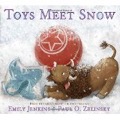
Prisca: This tender story is another of my new favorite books. While Little Girl is away on winter vacation, three of her toys decide to venture outside to discover what they can about snow. Lumphy is a stuffed buffalo who is curious and asks questions. StingRay is a plush stingray who responds poetically. And Plastic is a red rubber ball who shares facts. Before going out, Lumphy puts a mitten on his head to serve as a hat since he gets cold easily; and, StingRay crawls into a plastic bag punched with air holes since she is dry-clean only. Plastic goes “natural”. Working together, the trio turns the doorknob and goes out into the snow. They discuss their world blanketed with snow, build a snowman, make snow angels, and explore the yard before the sun goes down. StingRay describes the setting sun as “strawberry syrup pouring over the world to make it sweet before nightfall.” Plastic is thoughtfully quiet, before poetically likening herself to “a strawberry-syrup sun in the snow.” Cold and wet, the three friends head indoors to warm up and reflect on the sweet beauty of their day.
This is a story of friendship, curiosity, and collaboration that melts my heart every time I read it. I can’t stop looking at the art: the personalities of the three friends, the snow-blanked world they explore, the detailed evidence in the background that Little Girl lives there, and the reds that fill the ending pages, to name a few. Plastic beautifully brings together the factual and poetic as well as our oneness with nature as she connects herself to the strawberry-syrup sun.
Ray: The first thing that struck me is the front cover of the dust jacket and how glitter was used to give a textural feeling of snow. I was also struck by how Paul Zelinsky created the illustrations. As an artist I was sure he had used pastels but the information in the book states the illustrations were rendered digitally. Paul did a great job simulating pastel through digital illustration.
I’m impressed with Paul’s use of the fourth part of color, namely temperature, to create the indoor and outdoor scenes. The warm hues and grays he uses for indoors let readers feel the coziness while the cooler hues and grays used as the three friends go outside in the snow convey wintery frost.
StingRay is turquoise, or blue green, and Plastic is a red with a hint of orange. These colors are complements, or opposites, on the color wheel. Lumphy, who is basically a reddish brown, or earth color, as a buffalo would be, has a red nose and red ears, and hooves that tend towards the blue green. This gives him the hues of his two friends.
Prisca: What a neat symbolic way to highlight the friendship the three share. What about the use of red and other colors in the illustrations?
Ray: Red, as we see in Plastic, dominates on each page. It brings warmth to each page as the friends go outside to play in the snow. As the day come to an end and the sun is setting, we see the color of light bathes everything in red orange. StingRay calls it “strawberry syrup pouring over the world to make it sweet before nightfall.” It is interesting to note that the color of the shadows are blueish green, the complement of red orange, which is a foretelling of the night to come. The color of light at night, viridian green, or blueish green, is dominant in the last two double page spreads and the information page at the end. This duplicates StingRay’s color. Normally we would say this green is on the cool side of the color wheel, but we feel a warmth to this color of night, thanks to the artistic talent of Paul Zelinsky.
 The Wonder by Faye Hanson
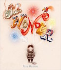
Prisca: This is one of my new favorite books! The richness and power of imagination and storytelling comes through so strongly. The young boy “whose head is filled with wonder” marvels at what he sees around him. He wonders where the birds are flying to, who makes the clouds in the sky, and what the best playground in the world is like. The adults he interacts with on his way to school caution him to keep off the grass and watch where he’s going. His various teachers warn him to pay attention and not daydream…until he gets to art class. There, his teacher provides him and his classmates with a blank piece of paper and invites the children to, “Just use your imagination.” The boy wonders and imagines across five double-page spreads filled with brightly colored images (no written text) that he weaves into his artwork. The boy shares is art with his classmates and parents. The story ends with the boy grown, standing in a museum beside a large sculpture titled “The Wonder” and surrounded by many excited people.
The sad part of the story for me is the way the adults and teachers respond to the boy, telling him to pay attention and not be “scatterbrained,” rather than fostering his inquisitive mind encouraging him to follow his imagination. Fortunately, the art teacher is there for the boy and children today in schools. But, it’d be so great if all teachers met kids’ imaginative needs.
Ray: A friend told me recently that her 7-year-old said she no longer draws pictures when she writes as she did in first grade because only writing counts and gets points in second grade. Written text is valued but ‘writing’ and communicating through pictorial text isn’t. As an artist, I “write” with a paint brush. Writing is one of many forms of communication. The Egyptians wrote in pictures or pictorial text. In Taiwan people write in Mandarin, using lines to create beautiful symbolic shapes that have meaning.
Prisca: We saw another example of this last summer at the ancient Indian ruin near Sedona, Arizona. The symbolic pictorial images on the walls date back as far as 10,000 years ago.
Ray: That’s right. This is important because the teacher mentioned above is essentially telling the students that they cannot communicate meanings through their pictorial imagination. Yes, imagination is used when writing written text. I love readings the novels of James Reynolds. He uses facts from many different subjects, but then his imagination takes over to create his great thriller novels.
Where would de Vinci and Michelangelo and others be, though, without their imaginations and opportunities to create in ways other than written texts? Michelangelo saw a large piece of stone that another artist had discarded because it had holes and a crack in it and took it home. Through his imagination that discarded stone became “David,” one of the greatest works of art of all time. Thus, imagination and wonder are critically important in education and life in general.
In The Wonder, Faye Hanson primarily uses neutral tones of grayish-brown in the art until the boy begins to wonder or imagine. Then she lets marvelous colors take over to communicate his thoughts, with no written text. One of those colors is red and hues close to red such as red orange or reddish brown. The large double-page pictorial spreads in the middle of the book revealing the boy’s imaginative thoughts come alive with all the wonderful intertwining shapes and colors. Red stands out and plays a very important role in these imaginative creations, bringing excitement and energy to this boy’s “wonders.”
Ray and Prisca, Thanks again for reminding us of the power of visual text and the profound affect just one color has on the meaning. I had a conversation a few minutes ago with a colleague who asked me, “At what age do kids begin to read?” When I talked about the visual text and the meaning gained from it, he was surprised. I’m going to share your My Takes with him–I suspect he will never look at picture books the same!
I am a retired teacher who consults with parents of gifted children. A partner and I co-facilitate SENG Model Parent Groups. Fine literature is always a topic! These will be on our list!