Cultural Issues in Reviewing Illustration
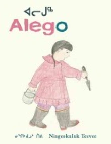
Our focus this week is a picture book from Canada, Alego, written and illustrated by Ningeokuluk Teevee and published by Groundwood Books/House of Anansi Press, 2009. Ningeokukluk Teevee is an interesting young artist from Kinngait (Cape Dorset), home to the great tradition of Inuit art. The book provides an authentic introduction to the life and world of an Inuit child. Our analysis of the illustrations in this book raises issues about illustration styles that are specific to a particular cultural group and how those styles might be read by viewers outside that cultural tradition. Alego is the story of an Inuit girl who combs a stretch of Baffin Island beach with her grandmother to collect clams and explore the tide pools. The story ends with the grandmother and grandchild sharing clams and hot tea. The text is in both Inuktiut and English. The author provides a picture glossary of Inuktitut words for sea creatures and includes a map of Baffin Island with an inset to locate the island on a map of North America on the endpapers.
The illustrations in the book were created in a traditional First Nation style. The textured graphite and colored pencil illustrations may initially appear simple, but a closer look indicates that they include complex foreground, middle ground, and background perspectives. The illustration of Anaanatsiag, the grandmother, calling to her granddaughter, Alego, includes a pronounced division between these three perspectives. The child and her grandmother are separated by a large expanse of water stretching across an ominous middle ground before the village in the far background is seen. The grandmother’s warning to her granddaughter, “Let’s go home before the tide comes back in and the shore is covered with water again,” is underscored by this visual division from the safety of home in the village.
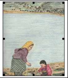
The struggle we had as readers, also mentioned by other reviewers, is that the story and illustrations seem to fall short in capturing the emotions of the characters. The illustrations do not portray a strong connection between the grandmother and child based on Western perspectives. None of the illustrations show the grandmother and granddaughter looking directly at each other. We realize this may be a cultural difference where direct eye contact is seen as disrespectful but found that this lack of connection robbed the illustrations of some of the emotional impact for us as readers. Another issue was the pale color palette in this book, often used to enhance the delicate nature of some stories. In this book, the lack of color intensity seems shallow and creates an ambiguity and vagueness to the illustrations and story. The story came across as an informational book about what lives in the sand and tide pools, rather than as a warm story of the relationship between a grandmother and granddaughter.
Our response to this book left us with many questions about whether the criteria we were bringing to our evaluation of the illustrations were appropriate or if we were imposing our cultural views about meaning-making through visual images. It also raises the question of the author/illustrator’s intention for this book, both in content and audience. Our analysis is based on our belief that the book is a story of the relationship between the grandmother and granddaughter, when the major intention of the author/illustrator may have been to teach children about the forms of life found on the beach. Another issue is whether the author/illustrator saw the major audience as First Nation children or created the book for a wider audience.
Our argument that reviewers need to attend to the role of illustrations in book reviews of international picture books is complicated by the need to consider the cultural styles of meaning-making that are embedded in the illustrations. The reviewer’s own background may interfere with understanding those illustrations, even if the reviewer has a strong background in art.
Journey through Worlds of Words during our open reading hours: Monday-Friday, 9 a.m. to 5 p.m. and Saturday, 9 a.m. to 1 p.m.


The fact that many First Nation cultures do not make direct contact is an important feature of the story and illustrations. It would have been inaccurate to portray these two characters elsewise. It was also important to the reader to see that the grandmother and granddaughter were busy doing things. These are action shots not family photos. I think this blog is shortsided and critical of something that the reviewers simply don't understand.
The illustrations do seem to fall short for me. I had a close relationship with my grandmother as a young girl and I do not see that type of relationship accurately portrayed in these illustrations. The illustrator needs to take onto account the many different types of people from many different backgrounds into account.
I find it interesting how you view the illustrations and how you interpreted the relationships with the use of color and facial expressions. I don't know how I would go about using color theory to analyze illustrations as text, but I would find it interesting if you know of a good article that explains how to do so. When I read an interview with the artist/author, she explained that she drew the pictures first and then added the text later. I found that to be an interesting way to go about writing a story. She explained that the illustrations were based off of her childhood memories living in the Cape. Perhaps the use of lighter hues was a way to communicate the relationship between stories and memory. Looking at other pieces by Ningeokuluk Teevee, I noticed that a few segments in her gallery of work resemble a similar aesthetic as the pictures in the book. Perhaps the colors represent an aesthetic she was experimenting with at the time rather than a distance between relationships in the book. It truly is difficult to have a discussion like this as an outsider looking in.
I also found your comment on the color palate to be interesting because I also noticed that all the illustrations almost seemed washed out due to the use of the light colors. It is fairly easy to analyze aspects of illustration such as clothing, setting, certain objects, posture, eye contact etc. as being part of a particular culture but color usage is much more difficult to specify. It is far from common knowledge for people to know what colors and strength of color are used by specific cultural groups. Also, even if we do have this type of knowledge, it cannot be definitively stated whether the choice of colors in the illustrations was due to the illustrator's culture or simply to his or her personal preference. Indeed it is difficult to say whether many of the choices illustrators make have anything whatsoever to do with culture or if they are simply entirely due to personal preference or some other culturally unrelated motivation.
I believe that your analysis makes many strong points. In particular, I think it was important to discuss the initial reaction of the illustrations seeming simplistic. I think that this reaction may lead to an adult reader initially being turned off by the book, but I think that it is important to remember that children have many different initial reactions than adults and that adults truly cannot step inside the mind of a child. I feel that children at times may be drawn towards more simplistic illustrations, and this may actually give the child reader feelings of inspiration to try to draw pictures in the same manner.