
Arctic White by Danna Smith, Illustrated buy Lee White
Prisca:
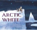
This is such a beautiful and intriguing book. It tells of a young girl who lives in the Arctic. In the dark days of winter everything around her is a shade of white and she longs to see color. One night her grandfather takes her on a journey to the top of a snowy mountain and suddenly the sky is filled with the colors of the Northern Lights. They enjoy the lights in their world and when the lights fade, the girl and her grandfather head home. To remember the lights, the girl paints pictures to hang on the walls of their igloo. It’s a lovely story that shows the close relationship between a girl and her grandfather with glimpses into winter life in the Arctic.
One aspect I really like about this book is how it shows that all “whites” are not the same: the blue-white tundra, the silver-white fox, the yellow-white polar bear, and even gray are all shades of white. You and I talked before about monochromatic color which is art done in different shades of one color. I know the girl, her grandfather, the boat, etc., aren’t white but would you say that Danna Smith’s descriptions of shades of white are monochromatic?
Ray:
Yes. Mono means one. A monochromatic image is basically created with only tints and shades of one hue (color). We get tints by adding white to a hue and shades by adding black. Artic White shows that there is more than one white. Black or another darkening agent added to white makes different shades of white.
Prisca:
I think of night as being dark. The book talks about winter days being “dark as night” which means there’s no real light, other than stars, the moon or fires or lanterns.
Ray:
Black is the absence of color. White is the addition of all color. We see this when light from the sun goes through a prism and comes out the other side in the hues on a color wheel. It’s similar to light passing through a raindrop (prism) and creating a rainbow (hues from a color wheel).
You talked about night and said there is no real light at night other than the examples you gave. When I ask students if there is light at night and what color is it, they usually say black, purple or maybe dark blue. The color of light at night is actually viridian green (a particularly dark shade of green). In Artic White you can see that artist Lee White “nailed it” in the double page spreads starting on the page with the text “in Northern Lights” and the following two double page spreads. Two other picturebook examples where artists understand the color of light at night and use viridian green are Moses (artist Kadir Nelson) and The Warlord’s Kites A Mathematical Adventure (artist Nicolas Debon).
The Night World by Mordicai Gernstein
Prisca:
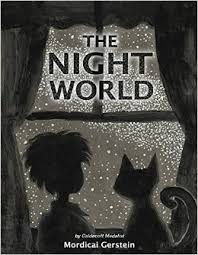
This book seems like the opposite of Arctic White. Instead of everything being shades of white, in The Night World everything is shades of black, showing not all blacks are the same. As the boy wanders through his house and his yard outside, we see his surroundings in shades of black. With no light, there’s no color.
Ray:
Black is the absence of color; white is the addition of all color. Yes, as you stated, to have color you need light. You can see color at night if there is some light from, for example, the moon or stars. However, color at night is very different in value and saturation than it is with brighter light.
Prisca:
I really like the feelings both the written and pictorial texts in this book evoke. The cat lures the boy outside to see what’s coming and is “almost here”. Outside the sky is filled with stars. The boy says, “The dark is soft and comfortable” but there’s a mysterious feel with the animals and plants in the shadows. Mordicai Gernstein’s use of value and saturation produce a range of shades with which he creates many images in the shadows. Shadows are not all black!
Ray:
The shadows are actually shades of gray and they take on the shapes of animals. The boy ask “where are the colors?’ When there is darkness and a lack of colored light, color is lost. You do see two spots of color while everyone waits for the light of dawn – the yellow eyes of the owl and the green eyes of the cat. This is a foretelling of the color of light at dawn, which is about to take place. The shadows, represented by many different animals, begin to slip away as dawn comes to overtake the darkness and color begins to return. Light brings color to their world.
Out of the Woods by Rebecca Bond
Prisca:
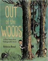
This is such an amazing story! And it’s true! Antonio’s mother runs a hotel in a town on a lake in Canada in 1914. A dense forest surrounds the hotel. One dry summer day a fire starts in the hills and spreads quickly. With the fire out of control, the only thing the people could do to be safe was to get in the lake. There they stood with water up to their knees and waists watching the fire. Suddenly, remarkably, bobcats, foxes, rabbits, wolves, deer, moose, elk, bears, etc., came out of the burning forest and got into the lake also. The animals and people stood in the lake, side-by-side, not bothering each other, and watched the fire. When it was safe to leave the lake, they all (animals and people) left the lake. Such an incredible story. What do you think about the art and Rebecca Bond’s choices of color?
Ray:
Rebecca chose the use of pen and ink with crosshatching to depict the life in a remote lumber camp at the turn of the 20th century. Color is then added with watercolor washes. The hues chosen by Rebecca are muted without any saturation until the fire starts and lights up the world with red and orange. You feel the heat from the fire with these hues. The cool hues of blue and green finally over take the very warm hues of red as the fire dies out and man and animals come out of the lake and return to the either their home in the forest or the hotel which has been saved. The cover gives us a hint of cool greens and the warm color of light coming from the fire, which is about to disrupt their lives.
Prisca:
I agree that the heat from the fire is very real in the art. The fear the animals and people feel at that point is evident too. The color of the front end papers picks up on that too, I think. The cool blues on the last page are quite the contrast, with a hint of the memory of the fire.
Ray:
The front end paper hue, orange, is a foretelling of the fire that is to come. All of the animals of the forest, which escape to the safety of the lake, are represented here in the front end papers. It is interesting that all the animals of the forest and humans, who are normally not friends, come together in the lake to escape the terror of the fire. One stands next to another, united to survive this fierily disaster. The cool green on the cover and throughout the book, is the complement of the orange and overtakes and conquers the orange to bring life back to normal in the end. The need to survive overcame all other concerns and animals and man bound together as one in this story of survival.
Daniel Finds a Poem by Micha Archer
Prisca:
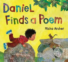
This is such a wonderful celebration of poetry! It makes poetry so real and visible in the world around us. Daniel sees a sign about “Poetry in the Park” on Sunday and sets out on a quest to learn what poetry is. Each day he asks another animal and gets another response that deepens his understanding. On Sunday, he pulls together all he’s learned to create a beautiful poem to share in the park. In addition to a story about poetry, the artwork is striking! Micha Archer shows the color of light at different times of the day in the book.
Ray:
This book brings together the wonderful technique of collage through the use of colored papers and oil paint. The artist in very beautiful illustrations uses all of the elements of art such as line, value, color, shape, space, form and texture. These marvelous illustrations use the principles of design such as pattern, balance, emphasis, rhythm, movement, variety and harmony, and contrast to create unity through each illustration in the book. The color of light, whether it be different times of the day or nocturnal light at night, are shown throughout the book
Prisca:
I particularly love the sunset illustrations and the last one, with the light reflecting in the water. The website where Micha Archer shows her process in creating the art is fascinating. She makes papers which reminds me of what Eric Carle does.
Ray:
I love the combination of the paper collage and the use of opaque paint that adds a wonderful textural dimension to each illustration. An example of this technique is the hard cover illustrations, which are under the dust cover. All parts of this book are an artistic jewel. You truly do feel poetry all around you.
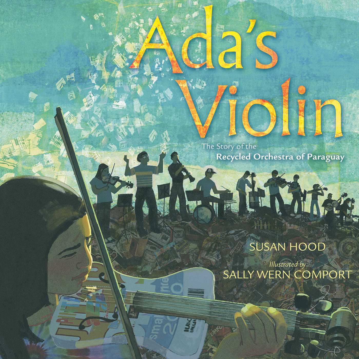
Ada’s Violin by by Susan Hood; Illustrated by Sally Wern Comport
Prisca:
This is such a powerful story of hope, determination, and resilience. Ada and her friends live in a town made of trash in Paraguay. People make a living by digging through the trash for things they can recycle or sell. Ada’s grandmother and family love music and she developed that love too, particularly for the violin. A teacher, Favio Chavez, comes to town with three guitars and two violins and wants to teach music. When he discovered he doesn’t have enough instruments for all of the students who want to play, he turns to the trash heap to find items he can use to make instruments. Eventually the Recycled Orchestra was born, with Ada as first violinist. Since then the orchestra has performed around the world. It’s an amazing story!
Ray:
Yes, it is a beautiful story told visually with the use a number of materials in collage (more than one material). Sally has done a wonderful job of conveying this story and the setting by using multiple discarded materials that could be found in a landfill. With her art Sally conveys the idea that out of poverty and despair can come joy and hope, found in the world of music. She adds drama to the double page spreads thru the use of chiaroscuro. Chiaroscuro is the dramatic contrast of light and dark value. This dramatic contrast speaks to the story being presented, the world of poverty contrasted against the joy of music, which lifts the young musicians out of a world of poverty to a world of hope and beauty.
Prisca:
I like that insight! It really shows how the art and written text are woven together not only in this book but in other picture books as well. I especially like how Sally uses scraps of music scores in the collages on a few pages.
Some scenes in the story are outdoors and some are indoors. Do you see chiaroscuro in both types of scenes? Can you give me an example?
Ray:
All of the double page spreads, whether inside or outside, are great examples of chiaroscuro. An example can be the double page spread of the close-up of the girl playing the violin. The dark in the foreground of the girl playing is contrasted against the light of the background. I love the intense and emotional feeling showing on the girl’s face, with her eyes closed, and feeling the music. The use of chiaroscuro is in the light hitting Ada’s darkened face. Each double page spread uses chiaroscuro to enhance the emotion and show how music has changed these young lives and had an effect around the world.
Prisca:
Yes, I like Favio Chavez’s quote in the Author’s Note. “Music allowed us to connect with other people. Without even speaking the language, we understand each other.”